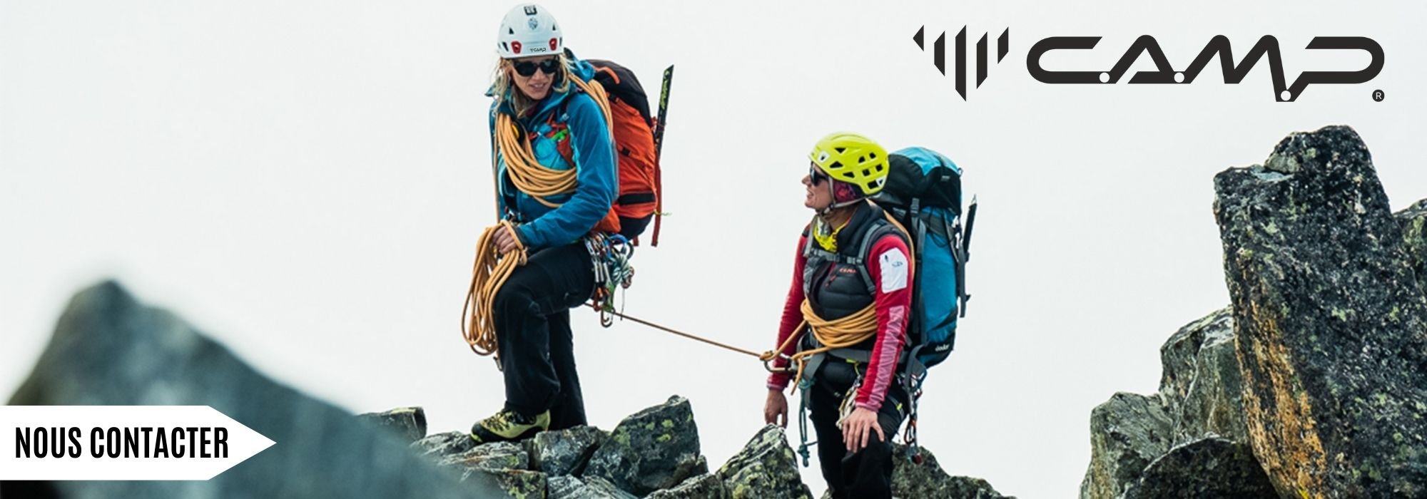

For several weeks now, the world leader in the manufacture of technical products for safety in outdoor activities and work at height has decided to implement a radical rebranding process. For all those looking for quality climbing gear or wishing to equip themselves with the latest innovations, let’s discover together what the new identity of CAMP is.
Why choose to focus on a single brand?
The brand felt it was necessary to convey a clear, distinctive, and highly recognizable image of CAMP. With the aim of highlighting a unique reality with its two divisions: outdoor and works. President Eddy Codega expresses this by saying, "Passionates and professionals will have a unique and precise reference to experience a renewed and in-depth experience of CAMP, developing a bond based on identification with our values." It should also be noted that if you are looking to buy mountaineering gear for your next outings, the CAMP range brings together all the suitable solutions.
But many may have noticed, a new logo has emerged in recent weeks.
What is the difference between the old logo and the new one?
| OLD LOGO | NEW LOGO |
 |
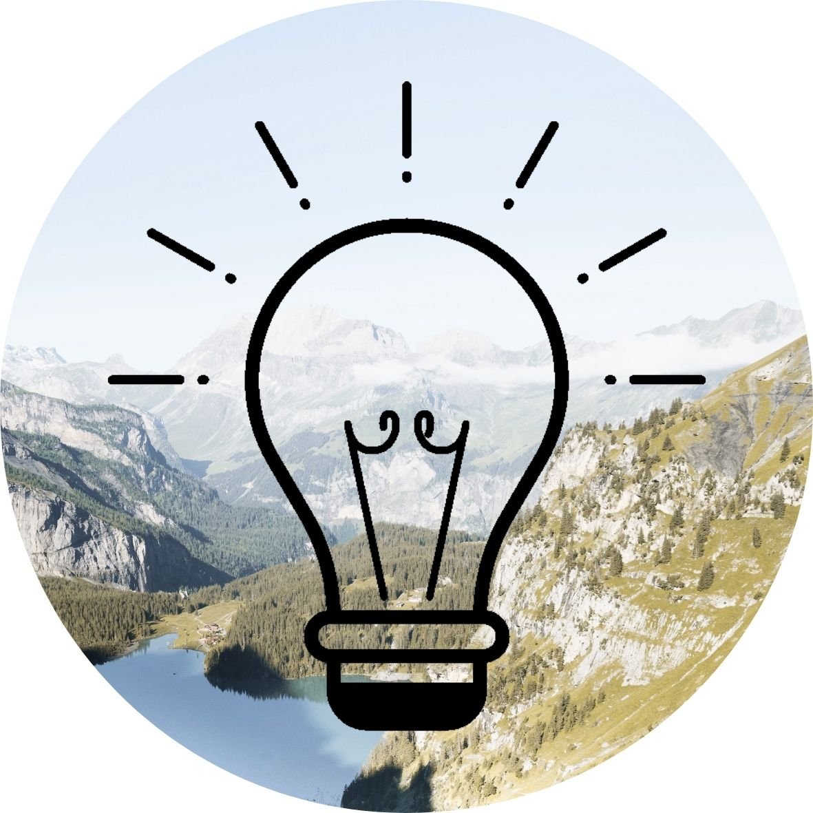
The new logo consists of a pictogram "gift of nature", a linear logotype that can be immediately recognized.
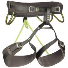
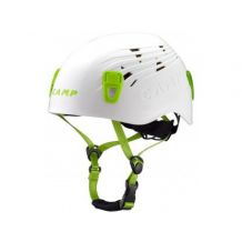
Additionally, the pictogram: a gift of nature is a true graphic engine of the rebranding. In fact, it is derived from the landscape on which Premana stands out, in the valley where CAMP has always been headquartered. The element has been developed appropriately to represent the field in which the company operates: verticality. Eddy Codega explains, "Verticality is the perspective we look at, in which we act and in which we continue to engage and invest." Whether you are a trekking or climbing enthusiast, it is essential to choose a harness for mountaineering to fully enjoy the safety offered.
DID YOU KNOW?
 | Behind each letter of the name CAMP, there is a world to discover. CAMP is an acronym, where behind each letter there is a word and a world to discover: "Construction of Mountain Articles Premana". Indeed, its clear, fluid, and continuous lettering offers a sense of movement and freshness. For your next adventures, do not hesitate to discover the entire mountaineering equipment available for this brand. |
What about the new slogan?
In this rebranding process, a new slogan has been designed to speak of a company capable of change. Those looking for quality mountaineering ice axes will also find their happiness in the CAMP range associated with its new identity.
CAMP has chosen "Evolutionary" to embody the brand's values. This new slogan emphasizes the company's ability to adapt to its reference scenarios. It thus refers to the image of a slow but inevitable, continuous, and constant transformation. The brand truly has the desire to look to the future. If you are considering buying a rope for mountaineering or improving your gear, the CAMP choice remains a reference.
With this video, we really understand everything that has allowed the creation of this new identity for this brand with beautiful prospects for evolution for the future. To complete your equipment, also discover all the high-performance mountaineering equipment and the technical mountaineering clothing designed to meet the demands of today's practitioners.
TO REMEMBER:
- CAMP IS THE WORLD LEADER IN THE MANUFACTURE OF TECHNICAL PRODUCTS FOR SAFETY IN OUTDOOR ACTIVITIES AND WORK AT HEIGHT.
- A NEW LOGO HAS BEEN CREATED TO CONVEY A CLEAR, DISTINCTIVE, AND HIGHLY RECOGNIZABLE IMAGE OF CAMP.
- THE NEW SLOGAN "EVOLUTIONARY" PERFECTLY EMBODIES THE VALUES OF THE BRAND.